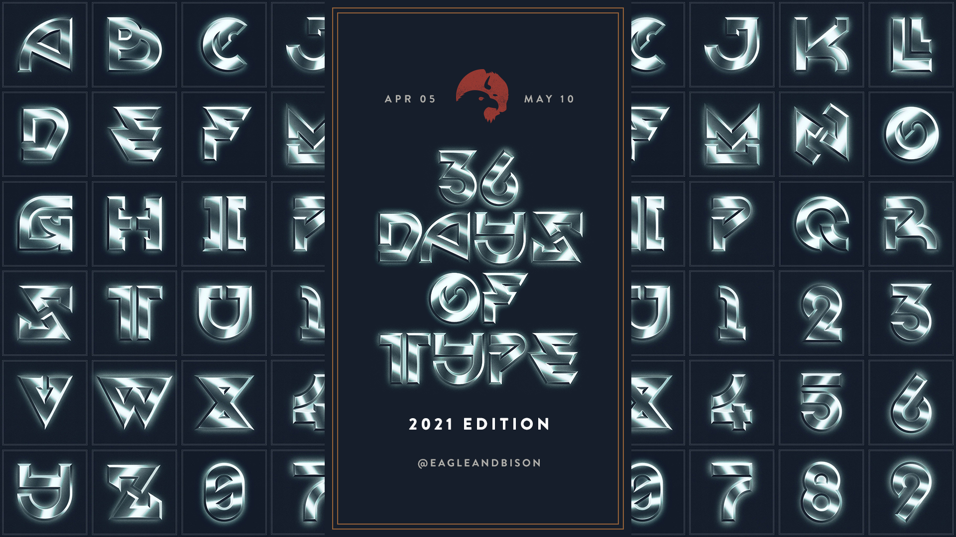
Over the past month, I’ve been partaking in a really cool community design project called the 36 Days of Type. This is is directly from their website:
36 Days of Type is a project that invites designers, illustrators and graphic artists to express their particular interpretation of the letters and numbers of the Latin alphabet.
36daysoftype.com
A yearly open call exploring the creative boundaries of letterforms, where participants are challenged to design a letter or number each day for 36 consecutive days, as a global and simultaneous act showing the outcome of the ability to represent the same symbols from thousands different perspectives.
A project that aims to be a space for creation around typography and its endless graphic possibilities.
This project is something I’ve seen going on for the past few years on Instagram and I decided that for the next one I was going to take part in it as a way to flex my type muscles a bit since it’s been a few months since I last worked on any new fonts and typography projects.
I had a plan going into it that helped streamline the process. It’s been almost 3 years since I last worked on any sort of daily design project, like the Daily 365 i completed in 2018. I learned a lot from that experience and did a lot of prep work. I created the actual characters 2 weeks in advance and batch designed each letter in its final form in chunks of 7 once a week.
In the end I’m super happy with how the whole font turned out. Check out each character below!